Theme installation
Before proceeding, make sure that the WooCommerce plugin is installed and active. If the WooCommerce plugin is missing or is not active, theme features and demo import will not be complete.
The WooCommerce plugin can be installed through the WordPress admin dashboard or by uploading files through FTP manually.
Installing WooCommerce through the WordPress admin dashboard
- Log into the WordPress admin panel.
- Go to Plugins -> Add New.
- Search for “WooCommerce”.
- In the search results, click on Install Now.
- When the installation is done, click on Activate button.
The theme can be installed in two ways – through the WordPress admin dashboard or by manually uploading files through an FTP.
Installing the theme through the WordPress admin dashboard
- Log into the WordPress admin panel.
- Go to Appearance -> Themes.
- Click on the Add New button, at the top of the screen.
- In the Add Themes screen, click on Upload Theme.
- Click on Choose theme, and then browse for the theme file on your computer.
- Click on Install Now to start the installation.
- After the installation is done, click on Activate theme.
Installing the theme by manually uploading files
- Download the latest theme version from ThemesKingdom.com.
- Extract the zip folder on your computer.
- Connect to your server using an FTP client.
- Upload extracted theme folder into ..wp-content/themes/ directory.
- Log into the WordPress admin panel.
- Go to Appearance -> Themes.
- Click on Activate theme.
A detailed video of theme installation is available here.
Theme customization
Setting up menus
Theme menus can be created under Appearance -> Menus. Created menus can be used when working with templates using Editor.
The navigation menu can be changed in the Editor – you can easily replace the default menu with your own.
- Go to Appearance -> Editor.
- In the Site Editor, click on the down arrow, near the template name, on the top of the screen. Click on the Browse all templates button.
- In the templates screen, click on Template parts on the left-hand side. Click on the header.
- The Menu placeholder is set. Click on it, and from the floating menu, click on Select Menu.
- Save changes.
Using the theme Editor
The theme can be customized using the Editor feature. The Editor allows you to control the layout and elements of the page templates. Go to Appearance -> Editor. More details on how to work with the Editor are available on this link.
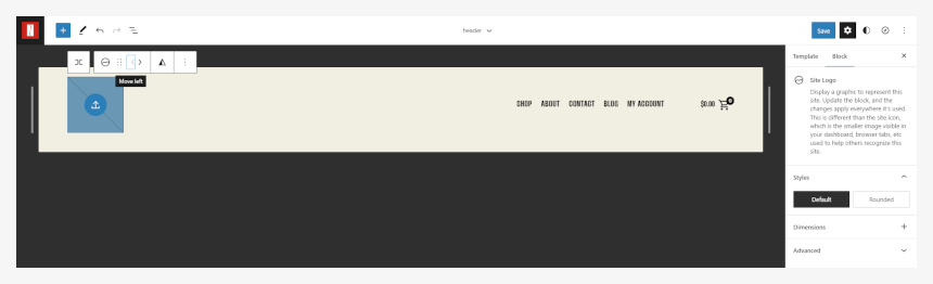
Setting up site logo
- In the Site Editor, click on the down arrow, near the template name, on the top of the screen. Click on the Browse all templates button.
- In the templates screen, click on the Template parts on the left-hand side. Click on the header.
- The Site Title placeholder is there. Click on it, and from the floating menu, select Remove site title.
- Click on the + button, and add the Site Logo block. Using floating menu position arrows place the logo on the desired side of the header.
- Click on the blue upload icon in the Site Logo element.
- Upload or browse for the desired logo. The logo should be a .png or .jpeg file.
- Save changes when you are done.
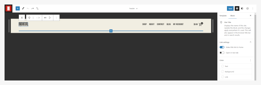
Setting up the site title
Site title can be set in the Appearance -> Customize, and under the Site Identity panel, you can set site title and favicon.
- In the Site Editor, click on the down arrow, near the template name, on the top of the screen. Click on the Browse all templates button.
- In the templates screen, click on the Template parts on the left-hand side. Click on the header.
- The Site Title placeholder is already there.
- Click on it, and enter the desired site title.
- Save changes when you are done.
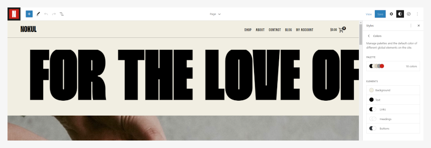
Changing colors and fonts
Text and Colors settings are global settings that are applied to the whole site and all elements.
- In the Site Editor, click on the Colors option in the right-hand side panel.
- Set the desired colors for the background, text, and links. The Color setting will be applied to the whole site and all pages.
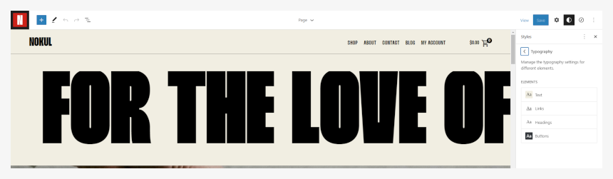
- In the Site Editor, click on the Typography option in the right-hand side panel.
- Here you can set the desired font families, sizes, line heights, and weights for text and links.
Footer is fully customizable – you can set the desired number of columns and various elements (e.g., menus, text, logo). Please note that before setting up menus in the footer, you will need to create those menus in Appearance -> Menus.
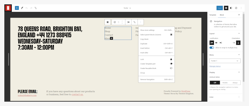
Replacing footer menus
In the footer element, links are created as text links, not as menus. Each link should be modified directly through the Editor.
- In the Site Editor, click on the down arrow, near the template name, on the top of the screen. Click on the Browse all templates button.
- In the templates screen, click on the Template parts on the left-hand side. Click on the footer.
- Find the menu that you wish to replace, and click on it.
- In the floating menu click on the three vertical dots, and click on the Show more settings.
- From the panel on the right-hand side select the desired menu.
- Save changes when you are done.
Adding a footer logo
By default, the footer uses three columns. You can add more columns if needed.
- In the Site Editor, click on the down arrow, near the template name, on the top of the screen. Click on the Browse all templates button.
- In the templates screen, click on the Template parts on the left-hand side. Click on the footer.
- Click on “+” button in the middle of an empty column.
- Add a Logo block. Click on the blue upload icon.
- Upload or browse for the desired logo. The logo should be a .png or .jpeg file.
- Using floating toolbox arrows, change the position of a logo column, or simply move the logo to the desired column.
- Save changes when you are done.
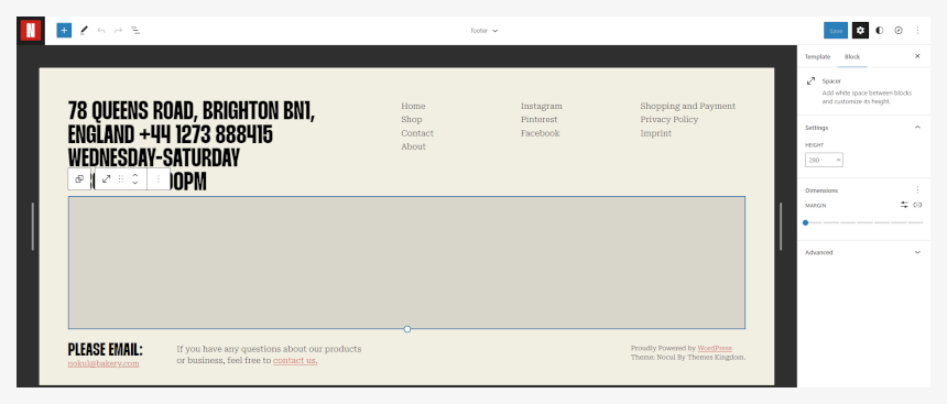
Reducing footer height
Under the contact details and navigation menu, there is a spacer element. If you wish to reduce the footer height, you will need to reduce the spacer height.
- In the Site Editor, click on the down arrow, near the template name, on the top of the screen. Click on the Browse all templates button.
- In the templates screen, click on the Template parts on the left-hand side. Click on the footer.
- Click on the spacer element under the contact details and navigation menus.
- Reduce the height of the spacer element.
- Save changes when you are done.
Theme defined patterns
Patterns are predefined blocks that can be added to the content. Patterns are groups of several blocks, so their content – text, and images – can be edited.
Besides standard patterns, the Edificio theme comes with theme-specific patterns. To add a pattern, click on the block Add button, and then click on the Browse All button in the floating block picker. In the left-hand side panel, click on the Patterns tab, and then pick the desired pattern group from the dropdown.
- TK Text
- TK Contact
- TK About
- TK Testimonials
- TK Gallery
- TK Headers
- TK Call to Action
To learn more about built-in patterns and how to work with them, please read our official guide WordPress Block Patterns.
How we built the Edificio demo
Before building the homepage, we suggest you create the desired pages and publish some posts and categories.
Then, move to the following pages:
- Home
- Shop
- Blog
- About
- Contact
Home
The homepage is built using several patterns and blocks. In the following text, you can read instructions on building the same homepage as shown in our demo. With a little bit of planning, you can create a homepage that will fully suit your needs, with more project categories, blog posts, etc.
The homepage is built from several sections. We will explain each section.
- The first section is the marquee block.
- The next block is a Call to Action pattern, with a background image and a button.
- Nokup favorites is a section that combines a heading with text and a button, with hand-picked products.
- Breakfast pricing section is combining a large image and pricing, placed in two columns.
- Breakfast pricing separator uses l-no-margin-top and l-no-margin-bottom .
- The next section is a large title, with a simple gallery.
- Final section is divided into two columns with the image on the left, and the text on the right.
Shop
The shop page is the WooCommerce page, where all products are displayed. This page is set as a Product Display page under WooCommerce -> Settings -> Product.
Blog
The blog page is displaying all posts. It’s set as a posts page in Settings -> Reading. There is no content on this page.
About page
The about page combines several elements.
- the First section is the heading, with a separator. Under the separator, the text is placed in the column, so it will stick to the left.
- The next element is the image element, with 5% padding to the left and right.
- Under the image, there is three column block, with text in the right column.
- The last element is a centered image, with text under it.
Additional CSS classes
Additional CSS classes can be inserted by selecting the desired element and adding that class to the Additional CSS class(es) field in the Advanced panel.
Theme classes that can be used:
- stick-to-top element will stick to the top of the screen, regardless of the page scroll.
- l-desktop-only element will appear only on computers.
- l-touch-only element will appear only on devices with the tocuh screen.
- l-above-mobile-only element will be shown only on devices with larger screen resolution.
- l-mobile-only element will appear only on the mobile devices.
- l-center-margin-auto element will get automatic left and right margin, and will be centered on the screen.
- l-no-margin-top removes the top margin from the element.
- l-no-margin-bottom removes the bottom margin from the element.
- background-color–transparent element will get transparent background.
- padding–horizontal-default adds default padding for the element. This class will prevent element from sticking to the left and right side of the screen. Padding values are 50px for computers, and 30px for mobile devices.
- no-padding–top removes the top padding from the element.
- no-padding–bottom removes the bottom padding from the element.
- no-padding–horizontal-on-touch removes left and right padding for all devices with touch screen.
- no-padding–horizontal-on-mobile removes left and right padding for all mobile devices.
- h-animate–from-top element with this class will float in from the top, when it comes into the viewport.
- h-animate–from-left element with this class will float in from the left, when it comes into the viewport.
- h-animate–from-right element with this class will float in from the right, when it comes into the viewport.
- h-animate–from-bottom element with this class will float in from the bottom, when it comes into the viewport.
- h-reveal–images–from-bottom Images with this class will animate when they enter the viewport. Animation is curtain reveal, from the bottom.
- stack-on-tablet–portrait elements inside the block with this class will be stacked on tablet devices, when the device is in the portrait orientation.
- animate-separator this class will add a eparator with animation effect from the left to the right.
- button-align-on-mobile–left class is used to align button to the left on mobile devices.
- button-align-on-mobile–center class is used to center align button on mobile devices.
- button-align-on-mobile–right class is used to align button to the right on mobile devices.