Loqui theme is a personal promotion and event theme. It’s an ideal theme for public speakers.
Learn how you can get the most out of the theme with the Loqui WordPress theme documentation.
Loqui WordPress theme documentation, step 1: Theme installation
The theme can be installed through the WordPress Admin panel.
- Log in to the WordPress admin panel.
- Go to Appearance -> Themes.
- Click on the Add New button, at the top of the screen.
- In the Add Themes screen, click on Upload Theme.
- Click on Choose theme, and then browse for theme file on your computer.
- Click on Install Now to start the installation.
- After the installation is done, click on Activate theme.
A detailed video of theme installation is available here.
Note: If you get the error message “The package could not be installed. The theme is missing the style.css stylesheet.” please unpack the zip file that you have downloaded, and inside the unpacked zip file you will find two more files – a parent and child theme. Install parent theme first, and then child theme. Activate the child theme when the installation is done.
After activating the theme, you will be prompted to install the required plugins. Required plugins in Loqui WordPress theme documentation are:
Jetpack plugin setup
Jetpack plugin is a required plugin. After installing the plugin, you will need to connect it with your site. When you click the Set up Jetpack button, you will need to log in to your WordPress.com account, or you’ll have to create a free Jetpack account. The official article that explains how to set up the Jetpack plugin is available here.
Loqui WordPress theme documentation, step 2: Theme features – explained
Besides of standard patterns, Loqui theme is coming with theme-specific patterns.
- Styled Text
- Contact Patterns
- About & Team Patterns
- Gallery Patterns
- Header Templates
- Call to action
To learn more about built-in patterns, and how to work with them, please read our official guide WordPress Block Patterns.
Loqui WordPress theme documentation, step 3: How we built our demo
Loqui demo is built as wedding invitation website.
First, we have created the following pages:
- Home
- Journal
- Events
- Bio
- Contact
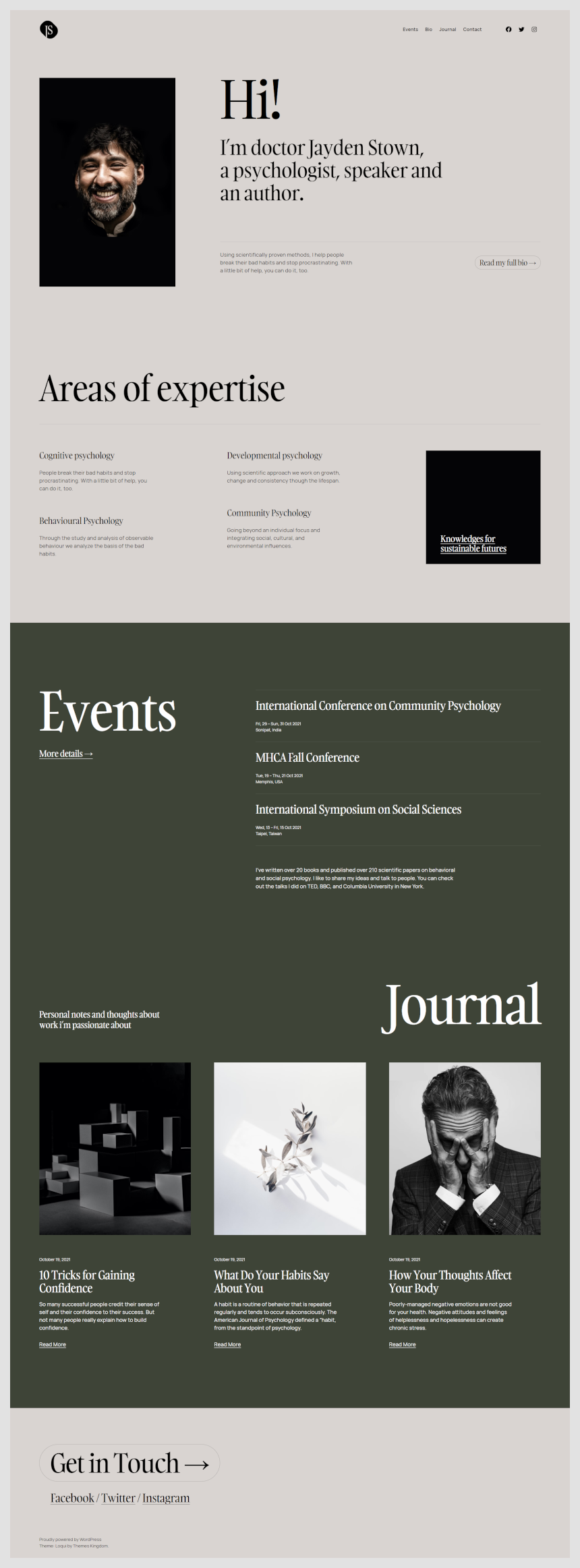
Home page
The homepage is built using several sections. The first section is using About Pattern 1.
The second section – “Areas of expertise” is built using a three-column layout, where we have placed text. On the last column from the left, we have inserted text with the background color.
For the “Events” section pick Two rows with headings pattern – in the left column insert the title “Events”, while on the right are displayed events.
“Journal” section is built using the Latest posts Gutenberg block. For the last section, we added a button with a link and links to social profiles.
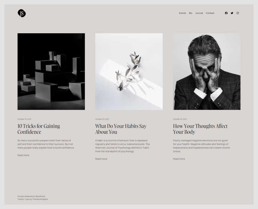
Journal
The Journal page is the page where all posts are displayed. There are no elements on this page. This page is using a template Index.
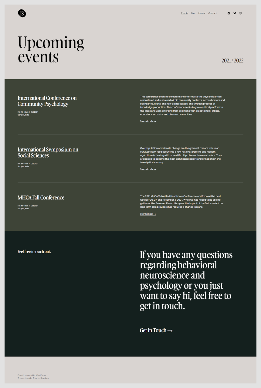
Events
The Events page is built to display upcoming events. It’s not depending on any custom post type. To build the Events page, we have inserted two columns – in the left column we have inserted the title, and on the right is displayed year range.
The following section is using a Text pattern of Two rows with headings.
In the last section, we have inserted two columns with text – text in the left section is set to a larger size.
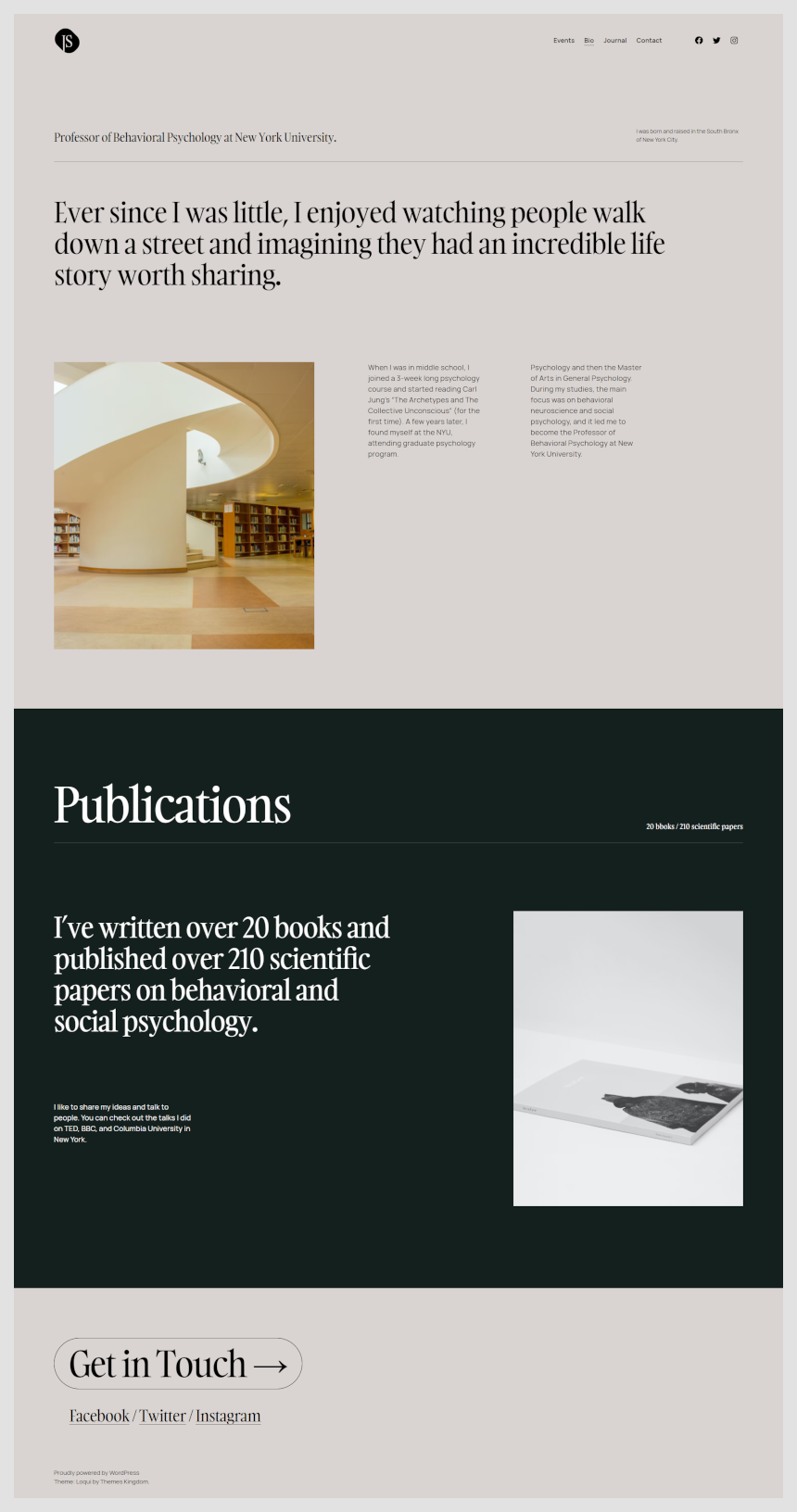
Bio
On the Bio page, the first section is using two columns layout with text. The next section is a standard H2 text. After that section, using a three-column layout, we have inserted the image on the first left column, and the text in the middle and the right column. Publications are once more using Text pattern Two rows with headings, but with additional image on the right.
Finally, on the bottom is a large button which is linking to the contact page and links to social profiles.
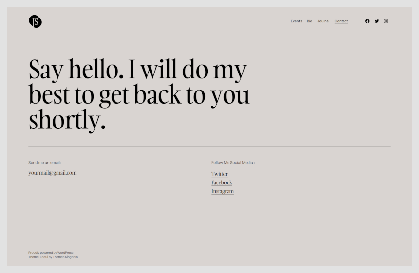
Contact
Contact page is using H2 heading text and a two-column section with an email address and links to social profiles.
Once when you are done, there are two things left to be done.
- Go to Appearance -> Menus and create a new menu. Add all pages to it, and mark menu as Primary.
- In Settings -> Reading set theme to use static page. For homepage set Home page, and for posts landing page set Journal page.
Loqui WordPress theme documentation, step 4: Working with theme templates
With the new WordPress feature – Full Site Editing – tech savvy users can easily tweak theme templates using Gutenberg editor, instead of messing with the theme code.
In Loqui theme, only header and footer templates can be tweaked. To start working with theme parts, in WordPress admin panel go to Appearance -> Template Parts. Click on the part that you wish to customize.
Here are example videos on how to perform simple changes in templates.
Loqui WordPress theme documentation, step 5: Useful CSS classes
Loqui theme is coming with pre-defined CSS classes. Those classes can be used for specific things, like display element only on mobile devices, or to reduce white space and such.
Here is a list of those classes:
- l-desktop-only: element will show only on desktop devices.
- l-touch-only: element will appear only on devices with touch scree – mobile phones and tablets.
- l-above-mobile-only: element will appear on all devices with screen bigger than mobile screen.
- l-mobile-only: element will appear on mobile devices only.
- l-center-margin-auto: element will be centered.
- l-no-margin-top: removes top margin. Comes handy if you wish to reduce whitespace between elements.
- l-no-margin-bottom: removes bottom margin.
- background-color–transparent: removes background color from element.
- padding–horizontal-default: adds left and right padding to the element. Adds 50px for dekstop devices, and 30px for mobile devices.
These classes are used on blocks that are placed on the page. To use classes:
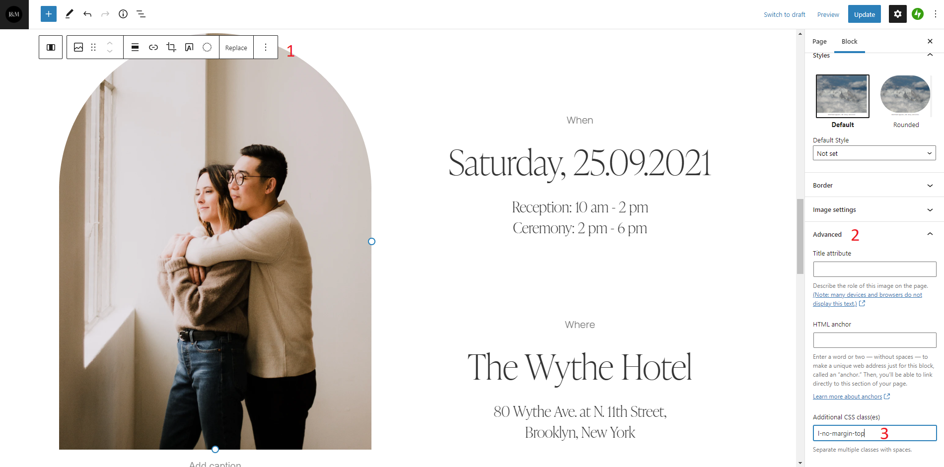
- Click on the desired element.
- Expand Advanced panel.
- Copy and paste name of the class.
If you need to use multiple classes, separate them with space.