Lenis
Theme installation
The theme can be installed in two ways – through the WordPress admin dashboard or by manually uploading files through an FTP. Before installing, please unpack the .zip file that you have downloaded, and inside the unpacked .zip file, you will find two more files – a parent and child theme. Install the parent theme first and then the child theme. Activate the child theme when the installation is done.
Installing the theme through the WordPress admin dashboard
- Log into the WordPress admin panel.
- Go to Appearance -> Themes.
- Click on the Add New button, at the top of the screen.
- In the Add Themes screen, click on Upload Theme.
- Click on Choose theme, and then browse for the theme file on your computer.
- Click on Install Now to start the installation.
- After the installation is done, click on Activate theme.
Installing the theme by manually uploading files
- Download the latest theme version from ThemesKingdom.com.
- Extract the zip folder on your computer.
- Connect to your server using an FTP client.
- Upload extracted theme folder into ..wp-content/themes/ directory.
- Log into the WordPress admin panel.
- Go to Appearance -> Themes.
- Click on Activate theme.
A detailed video of theme installation is available here.
Note: If you get the error message “The package could not be installed. The theme is missing the style.css stylesheet.”, please unpack the .zip file that you have downloaded, and inside the unpacked .zip file you will find two more files – a parent and child theme. Install the parent theme first and then the child theme. Activate the child theme when the installation is done.
Required plugins
Before proceeding, make sure that the Gutenberg plugin is installed and active. More details about Gutenberg plugins and plugin files can be found here.
Theme customization
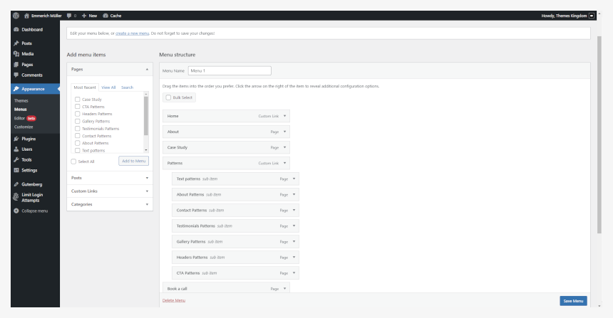
Setting up menus
Theme menus can be created under Appearance -> Menus. Created menus can be used when working with templates using Editor.
The navigation menu can be changed in the Editor – you can easily replace the default menu with your own.
- Go to Appearance -> Editor.
- In the Site Editor, click on the down arrow, near the template name, on the top of the screen. Click on the Browse all templates button.
- In the templates screen, click on Template parts on the left-hand side. Click on the header.
- The Menu placeholder is set. Click on it, and from the floating menu, click on Select Menu.
- Save changes.
Using the theme Editor
The theme can be customized using the Editor feature. The Editor allows you to control the layout and elements of the page templates. Go to Appearance -> Editor. More details on how to work with the Editor are available on this link.
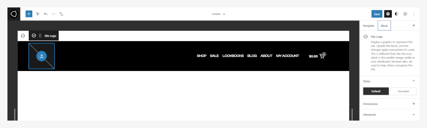
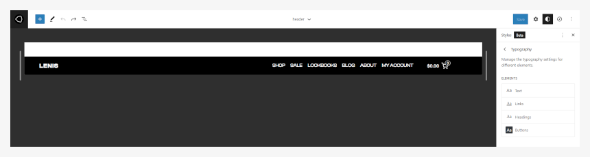
Setting up site logo
- In the Site Editor, click on the down arrow, near the template name, on the top of the screen. Click on the Browse all templates button.
- In the templates screen, click on the Template parts on the left-hand side. Click on the header.
- The Logo placeholder is already there. Click on the blue upload icon.
- Upload or browse for the desired logo. The logo should be a .png or .jpeg file.
- Save changes when you are done.
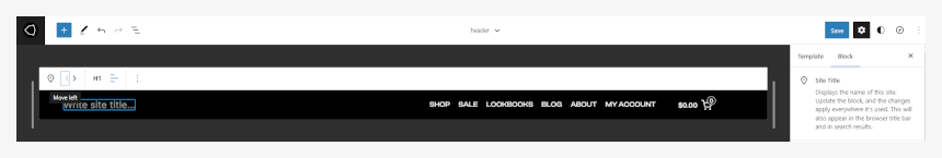
Setting up the site title
Site title can be set in the Appearance -> Customize, and under the Site Identity panel, you can set site title and favicon.
- In the Site Editor, click on the down arrow, near the template name, on the top of the screen. Click on the Browse all templates button.
- In the templates screen, click on the Template parts on the left-hand side. Click on the header.
- The logo placeholder is already there. Click on it, and from the floating menu, select Remove site logo.
- Click on the header container and then on the plus icon, to add a new element. Search for the “Site title” element.
- The Site title element will be placed on the far right of the header. Move it to the desired position.
Changing colors and fonts
Text and Colors settings are global settings that are applied to the whole site and all elements.
- In the Site Editor, click on the Colors option in the right-hand side panel.
- Set the desired colors for background, text, and links. The Color set will be applied to the whole site and all pages.
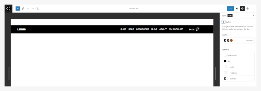
- In the Site Editor, click on the Typography option in the right-hand side panel.
- Here you can set the desired font families, size, line height, and weight for text and links.
Footer is fully customizable – you can set the desired number of columns and various elements (e.g., menus, text, logo). Please note that before setting up menus in the footer, you will need to create those menus in Appearance -> Menus.
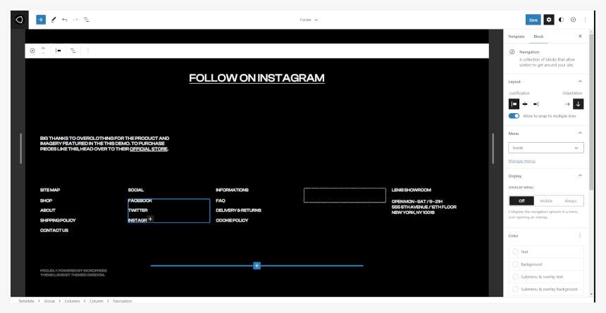
Setting Instagram image and link
The animated image and Instagram link in the footer are added in the footer template part.
- In the Site Editor, click on the down arrow, near the template name, on the top of the screen. Click on the Browse all templates button.
- In the templates screen, click on the Template parts on the left-hand side. Click on the footer.
- Select the main container. Add the Image element, and select the desired image. In our demo, we have created an animated gif image.
- Add spacer element under the image, and under it text with the link.
- Save changes.
Replacing footer menus and setting links
In the footer element, links are created as text links, not as menus. Each link should be modified directly through the Editor.
- In the Site Editor, click on the down arrow, near the template name, on the top of the screen. Click on the Browse all templates button.
- In the templates screen, click on the Template parts on the left-hand side. Click on the footer.
- Remove or add elements and set links for the desired items.
- Save changes when you are done.
Adding a footer logo
By default, the footer uses three columns. You can add more columns if needed.
- In the Site Editor, click on the down arrow, near the template name, on the top of the screen. Click on the Browse all templates button.
- In the templates screen, click on the Template parts on the left-hand side. Click on the footer.
- Click on “+” button in the middle of an empty column.
- Add a Logo block. Click on the blue upload icon.
- Upload or browse for the desired logo. The logo should be a .png or .jpeg file.
- Using floating toolbox arrows, change the position of a logo column, or simply move the logo to the desired column.
- Save changes when you are done.
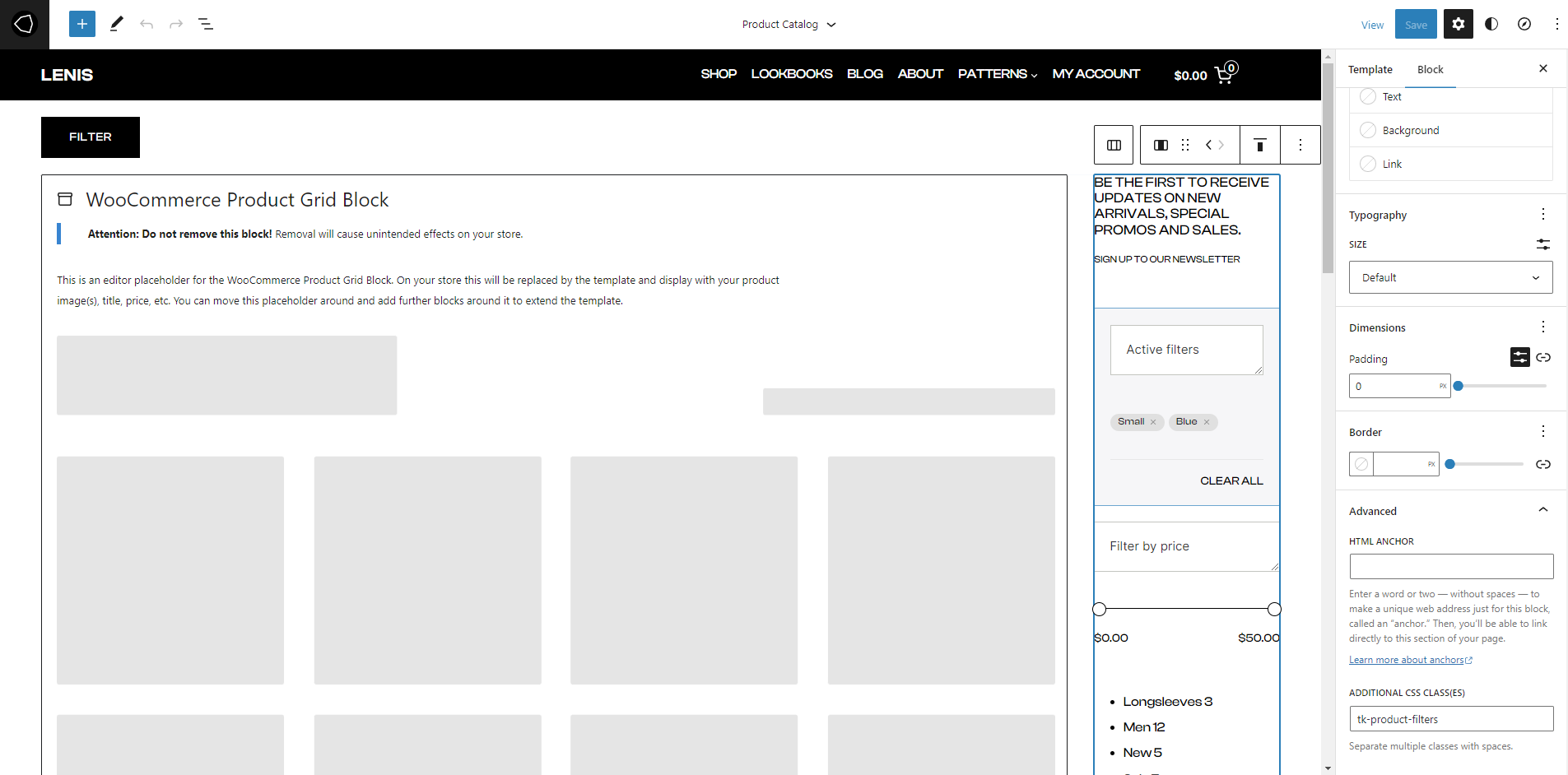
Hiding sidebar filters behind the button
By default, the product catalog page(shop page) is displayed with the sidebar filters. On mobile devices, the sidebar filter will be displayed before the products. But, the sidebar filter is hidden behind the button, so the visitors will focus on products, and expand the filter area only if they need to filter products by attribute, price, and such.
- In Site Editor, click on the down arrow, near the template name, on the top of the screen. Click on Browse all templates button.
- In the templates screen, click on the Templates on the left-hand side. Click on the Product Catalog.
- Shop is displayed in two columns. Click on the right column, where filters are displayed.
- Expand Advanced panel on the right.
- Add class
tk-product-filter
class to Additional CSS Class(es) field. This class will automatically hide the filter sidebar on mobile devices.
- Save changes when you are done.
Theme defined patterns
Patterns are predefined blocks that can be added to the content. Patterns are groups of several blocks, so their content – text, and images – can be edited.
Besides standard patterns, the Edificio theme comes with theme-specific patterns. To add a pattern, click on the block Add button, and then click on the Browse All button in the floating block picker. In the left-hand side panel, click on the Patterns tab, and then pick the desired pattern group from the dropdown.
- TK Text
- TK Contact
- TK About
- TK Testimonials
- TK Gallery
- TK Headers
- TK Call to Action
To learn more about built-in patterns and how to work with them, please read our official guide WordPress Block Patterns.
How we built the Edificio demo
Before building the homepage, we suggest you create the desired pages and publish some posts and categories.
Then, move onto the following pages:
- Home
- Shop
- Sale
- Lookbooks
- Blog
- About
Homepage
The homepage is built using several patterns and blocks. In the following text, you can read instructions on building the same homepage as shown in our demo. With a little bit of planning, you can create a homepage that will fully suit your needs, with more project categories, blog posts, etc.
The homepage is built from several sections. We will explain each section.
- The first section is the cover block, with a group where is placed heading and links for the shop and about us page.
- The next block is a hand-picked, five-column, products blocks. Before that block, we set the title with a link for the shop.
- Women’s and Men’s collection section is two column block, with cover blocks. Into each column, we inserted marquee text.
- On Sale section is hand-picked, five-column, product blocks. Before that block is set title with a link for items to the specific category.
[/video] - Row with Limited Edition is a full-width group, with media with text block. The image is inserted on the left, while the smaller image and promo text are on the right. At the bottom is a set marquee text block.
- Blog section is built using query loop and slightly modifying inherited grid template.
Shop
The shop page is the WooCommerce page, where all products are displayed. This page is set as Product Display page under WooCommerce -> Settings -> Product.
Sale
The sale page is a product category page. All products that are in the category Sale will be displayed on this page.
Lookbooks
The lookbook page is quite simple.
- the First section is the heading, with a separator. Under the separator, the text is placed in the column, so it will stick to the left.
- Images are placed in three columns element. Inside each column is inserted marquee text.
Blog
The blog page is displaying all posts. It’s set as posts page in Settings -> Reading. There is no content on this page.
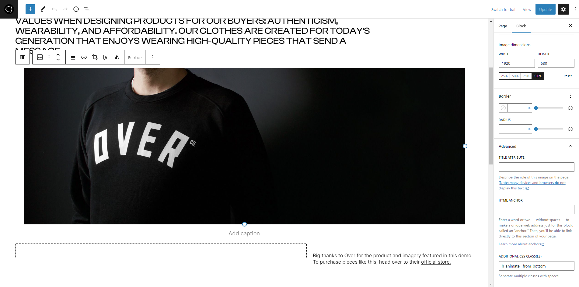
About page
About page combines several elements.
- the First section is the heading, with separator. Under the separator, the text is placed in the column, so it will stick to the left.
- The next element is image element, with 5% padding to the left and right.
- Under the image, there is three column block, with text in the right column.
- The last element is a centered image, with text under it.
Additional CSS classes
Additional CSS classes can be inserted by selecting the desired element and adding that class to the Additional CSS class(es) field in the Advanced panel.
Theme classes that can be used:
- stick-to-top element will stick to the top of the screen, regardless of the page scroll.
- l-desktop-only element will appear only on computers.
- l-touch-only element will appear only on touch screen devices.
- l-above-mobile-only element will be shown only on devices with larger screen resolution.
- l-mobile-only element will appear only on mobile devices.
- l-center-margin-auto element will get automatic left and right margin, and will be centered on the screen.
- l-no-margin-top removes the top margin from the element.
- l-no-margin-bottom removes the bottom margin from the element.
- background-color–transparent element will get transparent background.
- padding–horizontal-default adds default padding for the element. This class will prevent the element from sticking to the left and right side of the screen. Padding values are 50px for computers, and 30px for mobile devices.
- no-padding–top removes the top padding from the element.
- no-padding–bottom removes the bottom padding from the element.
- no-padding–horizontal-on-touch removes left and right padding for all touch screen devices.
- no-padding–horizontal-on-mobile removes left and right padding for all mobile devices.
- h-animate–from-top element with this class will float in from the top, when it comes into the viewport.
- h-animate–from-left element with this class will float in from the left, when it comes into the viewport.
- h-animate–from-right element with this class will float in from the right, when it comes into the viewport.
- h-animate–from-bottom element with this class will float in from the bottom, when it comes into the viewport.
- add-bullet adds bullet before a paragraph. Used mostly for cosmetic changes.