Theme installation
The theme can be installed through the WordPress Admin panel.
- Log in to the WordPress Admin panel.
- Go to Appearance -> Themes.
- Click on the Add New button, at the top of the screen.
- In Add Themes screen, click on Upload Theme.
- Click on Choose theme, and then browse for theme file on your computer.
- Click on Install Now to start the install process.
- After the installation is done, click on Activate theme.
A detailed video for theme installation is available here: https://help.themeskingdom.com/how-to-install-and-setup-the-theme.
After activating the theme, you will be prompted to install the required plugins. Required plugins are:
Jetpack
Jetpack is the world popular plugin that extends WordPress features. In the Millenio theme, it is used to extend galleries’ features and protection. The official documentation is available here: https://help.themeskingdom.com/jetpack-plugin/.
Kirki
Kirki is a plugin that enhances theme experience by adding useful elements in the Customizer, like image position picker, font settings and such.
Slider Custom Post Type
Slider Custom Post Type plugin adds Slider post type to the theme.
WooCommerce
WooCommerce is a free eCommerce plugin that allows you to sell anything. Built to integrate seamlessly with WordPress, WooCommerce is the world’s favorite eCommerce solution that gives both store owners and developers complete control.
YITH WooCommerce Wishlist
Wishlist allows visitors to “save” items for later, without adding them to the cart. Items on wishlist can be reviewed, and removed if they are no longer needed.
Theme demo
To set the theme as presented in our demo, you can import the demo file.
Theme Setup
Before starting the setup, please install and setup the WooCommerce plugin. During the setup process, you will need to set up store address, set payment methods, and shipping methods. WooCommerce will also create all pages that are required for a shop – Shop, Cart, Checkout, and My Account.
To set up the theme, please follow the next steps:
- First, go to Pages -> Add New, and create pages Home, About, Journal, and Contact. For Home page set the Front Page template, while the other pages should use the Default template.
- In the Contact page, you will need to insert your contact details and add a contact form.
- Go to Settings -> Reading. Select the homepage to display a static page. For Homepage set the Home page, and for Posts, page set the Journal page.
- Create some posts – go to Posts -> Add New and create several posts. Be sure to set featured images. All posts will be displayed on the Journal page.
- Go to Products -> Categories. Create several product categories – in our demo we have created categories Accessories, Bags, Jewelry, Blazers, Dresses, etc… Categories are used to group similar products – and to display product groups in the navigation.
- Create several products and associate them with the product categories.
- In the Slider section, create two new slides. You will need to set featured images for the slides. In titles, you can use a simple HTML markup like strong and em to create bold and italic text.
- To set up the main navigation go to Appearance -> Menus. Create a new menu and enable first the Max Mega Menu, in the left-hand side panel. Now you can add items. When you are done with the structure, point the cursor over the top menu item and click on the Mega Menu button. In the Mega Menu panel, select Grid Layout, and add top items in the columns. The menu will automatically recognize subitems. Mark menu as a Primary and save changes.
You will also need to create additional menus which will be displayed in the footer widgets – Social menu with links to your social profiles, Company with links to static pages and Help – which can lead to Terms and Conditions, and any other page that is related to your shop. - Now, it’s time to build the homepage.
- Go to Appearance -> Customize and set the following options:
- Site Identity: Set site logo and favicon.
- Content Options: Enable author bio on a single post.
- Widgets: Add widgets to the desired widget areas. In our demo, we have set:
- Sidebar: Two text widgets, one image, one Recent Posts, and Mailchimp subscribe widget.
- Footer Widgets 1: Three Navigation Menus – Company, Help, Social. Note: Only Navigation Menu widgets will be displayed inline, all other widgets will be stacked.
- Footer Widgets 2: Add the MailChimp subscription widget.
- Footer Widgets 3: Leave blank.
- Theme Options:
- Header Settings: Disable the sticky header, and set Logo Position to Center.
- Footer Settings: Enter the desired footer credits. You can use HTML elements to style the text.
- Category Filter Settings: Enable category filters on archive pages.
- Banner Settings: Enable top banner and enter a text for the top banner.
- Mailchimp Newsletter Modal Settings: Enable MailChimp modal, set background image, and set modal to show on Scroll up.
- Front Page Settings:
- Front Page Slider Settings: Enable slider on the front page, and set the number of slides. Make sure that you have created slides before enabling the slider.
- Call To Action Section Settings 1: Set Call to action Layout to Full-Width, set larger image (e.g. 1920x800px). Enter title and content – you can use HTML elements to style your title and content.
- Call To Action Section Settings 2: Set Call to action Layout to 2/3 + 1/3. Set images for each section and enter title and content – you can use HTML elements to style your title and content.
- Call To Action Section Settings 3: Set Call to action Layout to 1/2 + 1/2. Set images for each section and enter title and content – you can use HTML elements to style your title and content.
- Call To Action Section Settings 4: Set Call to action Layout to Full-Width, set larger image (e.g. 1920x800px). Enter title and content – you can use HTML elements to style your title and content.
- Products Section Settings: Enter the title (“New Arrivals”) and subtitle (“Summer – Spring 2018”), and set the display to a carousel. Select the Newest products category. Set the number of products to 10. Before setting this up, you will need to create Products.
- Blog Section Settings: Enter the title (“Editorial content”) and subtitle (“Be the first to know.”). Leave the category unselected – that way posts from all categories will be displayed.
- Front Page Sections Order: Set sections in the desired order, or set as in our demo: Call to action section 2, Call to action section 3, Call to action section 1, Products section, Call to action section 4, Blog section.
- WooCommerce:
- Shop Header Settings: Enable both – My Account and Saved items, and Mini Cart.
- Shop Layout: Set it to Regular Grid, set shop sidebar to No Sidebar, and set the number of columns on the Shop and Product category page.
The Customizer
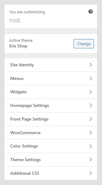
The Customizer is a great WordPress feature that allows you to customize the theme and set theme options. Customization options available in the Customizer:
- Site Identity
- Menus
- Widgets
- Homepage Settings
- Front Page Settings
- WooCommerce
- Color Settings
- Theme Settings
- Additional CSS
Site Identity
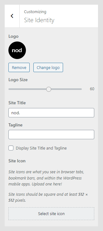
Site Identity allows you to set your site logo, title, tagline, and icon. The Site Title is the name of your site, and it’s displayed in the header, where the logo is displayed. The Tagline is the short description or your motto, and it’s displayed just under the title.
- Logo: For the logo, set a JPG, JPEG, or PNG image.
- Logo Size: Moving the slider to the left or right will increase or decrease the logo size. Changes in logo size will be displayed in the preview panel.
- Site title: Name of your site. The Site Title is displayed only if a logo is not set.
- Tagline: Site punchline. The Tagline will be displayed together with a logo or Site Title.
- Display Site Title and Tagline: If enabled, both title and tagline will be displayed in the header.
- Site Icon: The Site Icon is used as a browser and app icon for your site. Icons must be square, and at least 512px wide and tall.
Menus
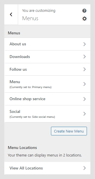
This option allows you to manage created menus quickly. You can select what menu will be displayed as a Primary Menu or Social Menu. If you need to manage actual menu items, you can do that in Appearance -> Menu.
Widgets
The Widgets section allows you to manage widgets in widget areas quickly. This option allows you the same possibility as the Widgets option in the WordPress admin panel.
Homepage Settings
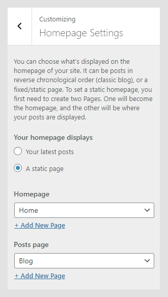
This option works the same way as Settings -> Reading. It allows you to set them to read the latest post or to use static pages for landing and blog pages.
Front Page Settings
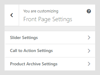
Frontpage settings panel contains sub-panels that control the appearance of the homepage elements.
Slider Settings
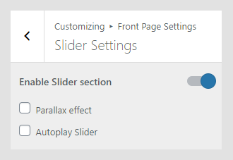
In the Slider Settings panel you can:
- Enable Slider Section: The slider section can be enabled or disabled.
- Parallax effect: If enabled, the slider will have a parallax effect while scrolling.
- Autoplay Slider: If enabled, the slider will autoplay slides.
Call to Action Settings
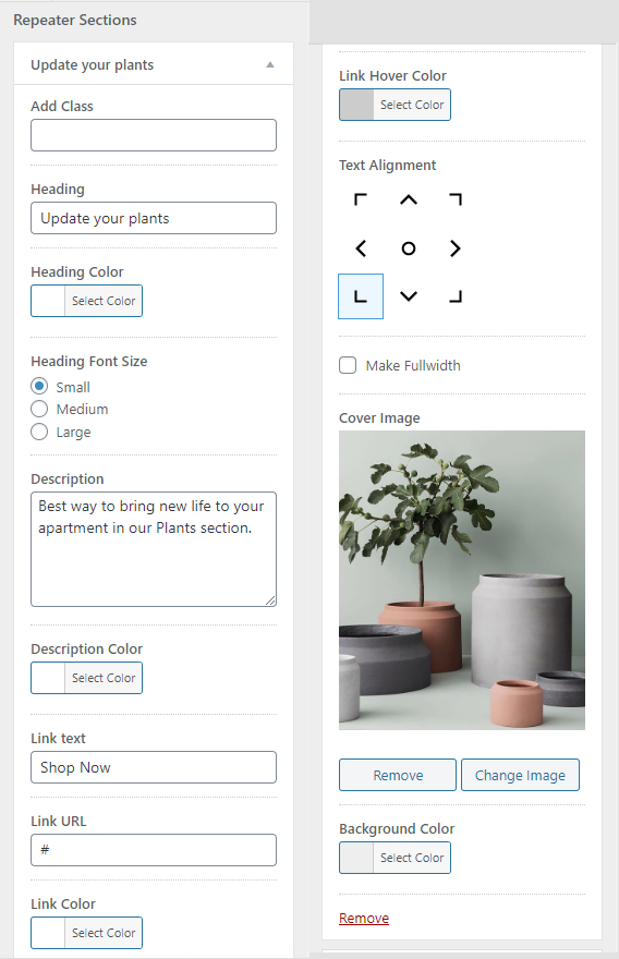
Call to action section is displayed on the homepage, and is used to build layout.
- Layout: Call to Action sections can be displayed in two, three, or four columns, or in a shuffle mode.
- Add Class: Enter the name of CSS class that you wish to use with the section. Extra CSS class allows you to style your section.
- Heading: Title that will be displayed on the image.
- Heading color: Color of the heading.
- Heading Font Size: Heading sizes are small(20px), medium(36px) and large(50px).
- Description: A short paragrpah that will be displayed under the heading.
- Description Color: Color of the text on the homepage.
- Link text: Call to action text that will be linked.
- Link URL: Destination link for CTA – can be internal or external URL.
- Link Color: Color of the link in CTA block.
- Link Hover Color: Color of the link in CTA block on hover action.
- Text Alignment: Postion of the text in CTA.
- Make Fullwidth: If checked, CTA section will be displayed in the full-width.
- Cover Image: Set the background image for CTA section.
- Background Color: Background color for CTA section. It will be used if the image is not set.
In our demo, we added four Call to Action sections, where one is set to fullwidth, and layout is set to three columns.
Product Archive Settings
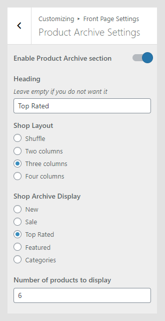
Product Archive Settings cover settings for the product section on the homepage.
- Enable Product Archive section: If enabled, the product section will be displayed on the homepage.
- Heading: Heading that will be displayed on the top of the products section.
- Shop Layout: Products can be displayed in two, three or four columns, or in a shuffle mode.
- Shop Archive Display: Option that defines what products will be displayed – New, on Sale, Top Rated, Featured or specific categories.
- Number of products to display: How many products will be displayed.
WooCommerce
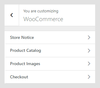
The WooCommerce panel keeps settings specific for the Shop – notices, what products and categories will be displayed, and theme-specific image sizes for the Shop.
Store Notice
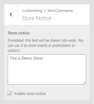
Store notice allows you to display a short message on the top of the site. This message can be related to discounts, new products, etc…
Product Catalog
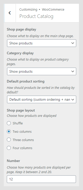
Product catalog defines how WooCommerce pages – main store page and product category pages – will display products, how many and in what layout.
- Shop page display: Choose what to display on the main Shop page – products, categories, or both.
- Category display: Choose what to display on product category pages – products, subcategories, or both.
- Default product sorting: Defines the parameter that will be used for default product sorting.
Product Images
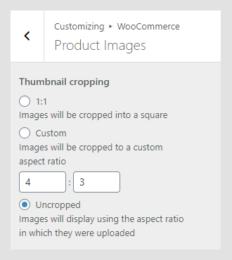
Settings related to image width on the Shop and single product page.
- Main image width: Main product image width, which will be used on the single product page.
- Thumbnail width: Width for the main product image on the Shop page.
- Thumbnail cropping: How the thumbnail will be cropped. There are three settings: 1:1 – the image will be cropped proportionally based on original dimensions; Custom – depending on the input value, cropping will use that proportion; uncropped – the image will be scaled down.
Checkout
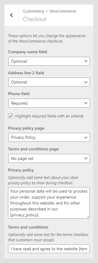
The Checkout section contains settings related to the Checkout page. Here, you can customize what optional fields are displayed and if they are required, and you can configure Privacy policy and Terms and conditions pages and notices.
Color Settings
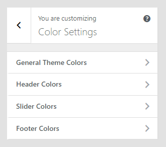
The color settings panel covers color options for various parts of the site. Colors can be set for:
- General Theme Colors
- Header Colors
- Slider Colors
- Footer Colors
Theme Settings
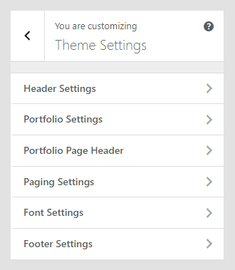
The theme Settings panel contains theme-specific settings. Available options are:
- Header Settings
- Portfolio Settings
- Portfolio Page Header
- Paging Settings
- Font Settings
- Footer Settings
Header Settings
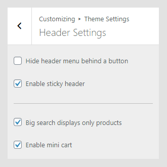
In the Header Settings, you can set the navigation appearance, enable the sticky header, set the search range for, and control the mini-cart.
- Hide header menu behind a button: If enabled, the menu will be hidden behind a button on all devices.
- Sticky header: If Enabled, the header will always appear at the top.
- Big search displays only products: If enabled, the search will display only results from products.
- Enable mini cart: If enabled, the mini-cart will be displayed in the header.
Portfolio Settings
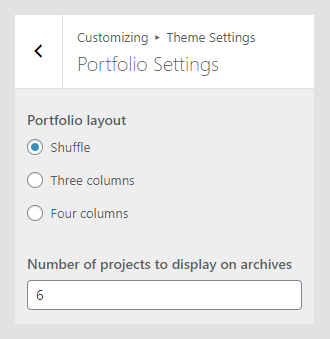
The Portfolio Settings panel controls the Portfolio page layout. The portfolio page layout can be set to shuffle mode – in this case, portfolio items will be scattered around, without the precise grid. Other options include standard 3- and 4-column grid.
Portfolio Page Header
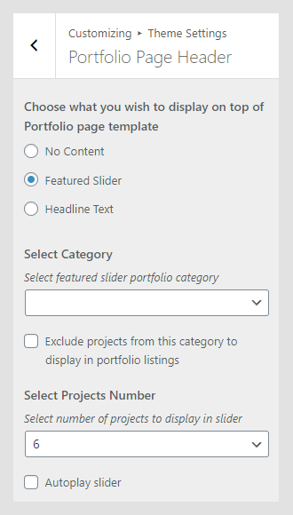
On the page with the portfolio template can be displayed slider or headline text. Depending on the selection, additional options in this panel will be displayed.
Paging Settings
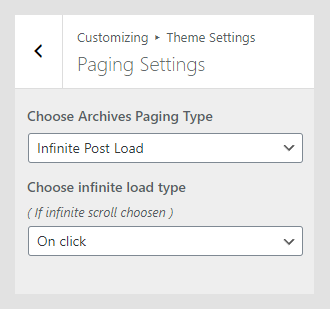
Paging settings control how pagination will be displayed – it can be classic, numbered, or infinite scroll. Infinite scroll can be triggered on click or on constant scrolling.
Font Settings
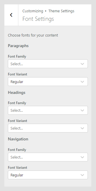
In the Font Settings panel can be set font families and font variants for paragraphs, headings, and navigation on the site.
Footer Settings
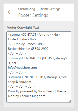
Footer Settings have only a text area. Add text to the footer copyright area. HTML elements can be used for formatting.
Additional CSS
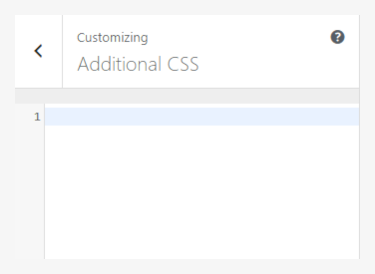
The Additional CSS section is used for custom CSS classes, without interfering with theme original CSS files or creating a child theme. These classes are always loaded first, before other stylesheets. In the Useful CSS Classes section, you can find some most used classes.